
Filippo Gori
ROLE
UI/UX Designer
GOAL
Adapt core UX to a fully branded Costa Crociere on-board experience and introducing promotional flows for photo commerce
Project OVERVIEW
TL;DR
GetPica was brought onboard, literally. Costa Crociere's photo shop, running on interactive tablet stations across the fleet, needed a new engine. The interface was rebuilt from scratch: faster, branded, and designed for the kind of user who has never heard of GetPica and just wants to find their photos.


ROLE & TEAM
As the only one designer in the company, I worked directly with the Head of Product in a hybrid UI/UX role.
Daily collaboration with CTO and development team (2 backend, 1 frontend) was crucial. Design decisions were continuously shaped by technical constraints, integration rules, and real-time feasibility trade-offs.

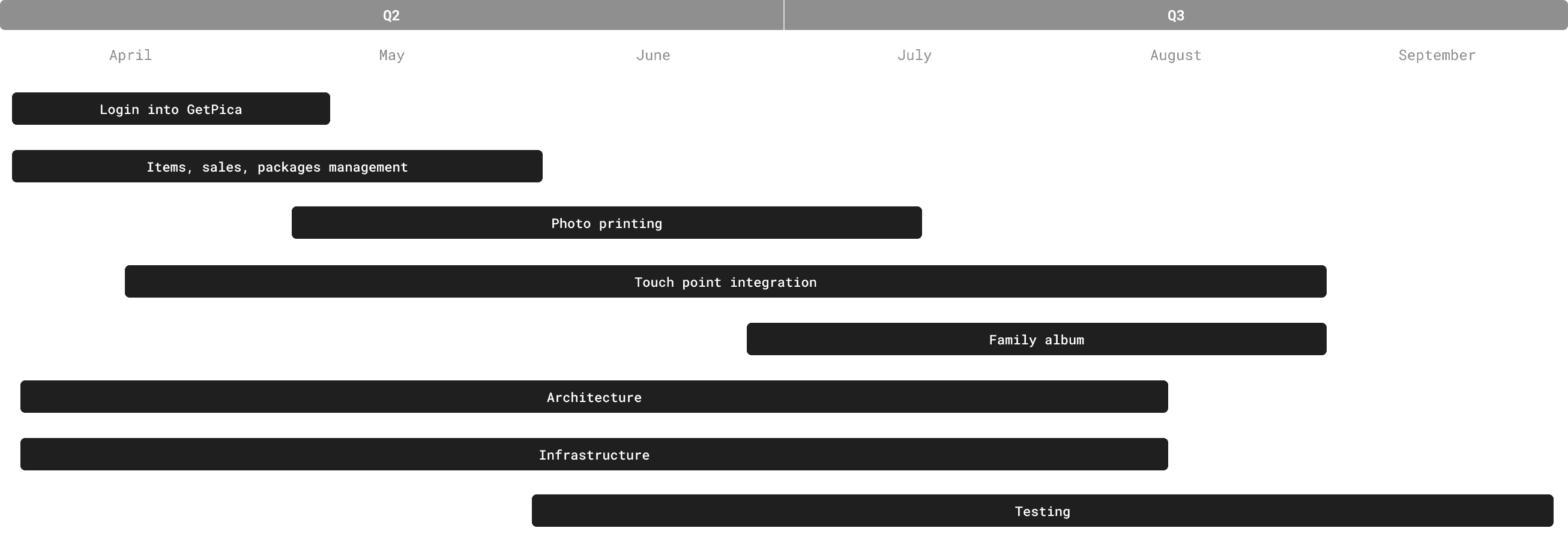
Project timeline
The interface
——
01 - Legacy interface (before)
Outdated tablet flow, designed for a system that no longer existed
Outdated visuals, inconsistent layout, slow interactions.
No clear hierarchy, scattered CTAs, and minimal branding alignment.
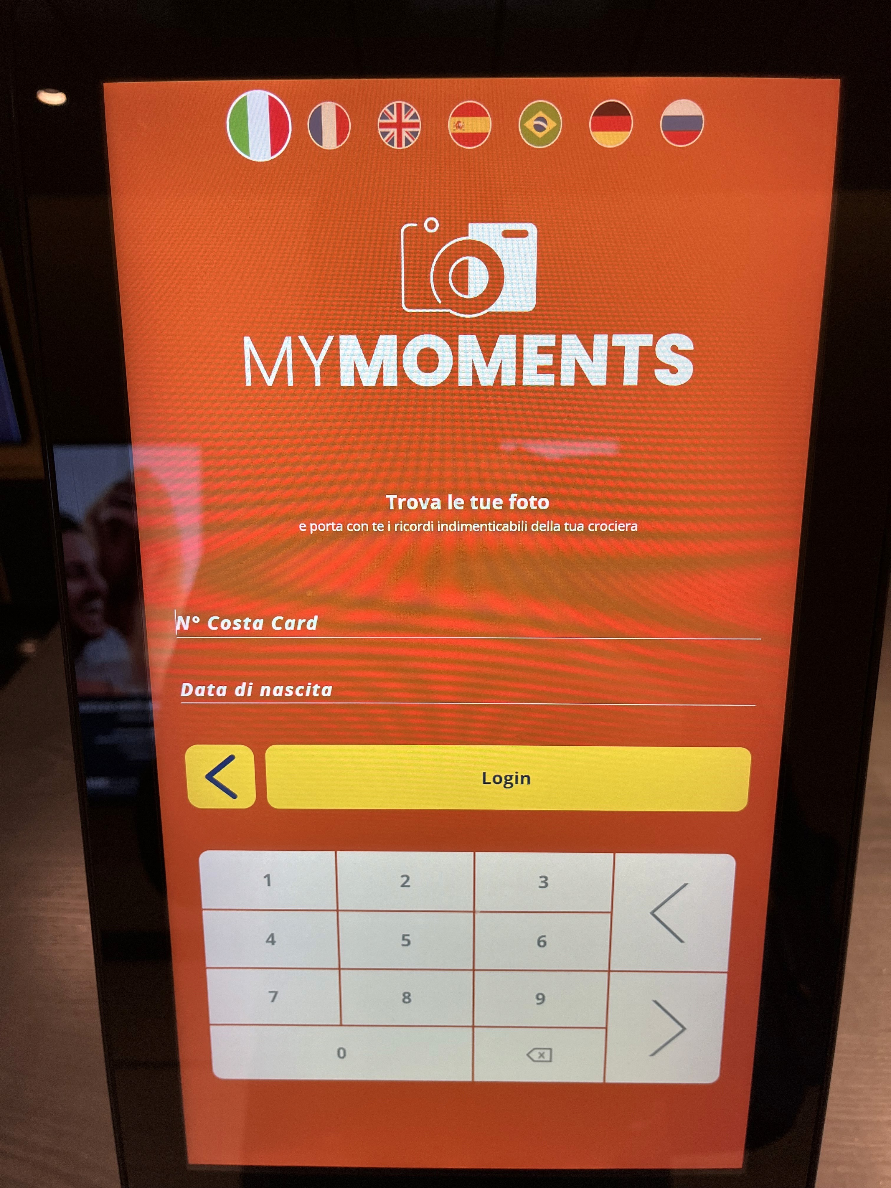
¹LEGACY ONBOARDING TABLET EXPERIENCE
This is what greeted guests at the photo shop. Buttons too large, text too small, elements scattered near the edges of the screen: a layout designed without the tablet in mind. No visual hierarchy, no brand coherence, no clear path forward. Just a screen asking users to figure it out on their own.
¹LEGACY ONBOARDING TABLET EXPERIENCE
02 - initial exploration
Rough sketches to validate structure, navigation, and component placement.
Early UI reconstruction based on the legacy screens.
Tablet-first redesign to fix layout, spacing, and interaction patterns.
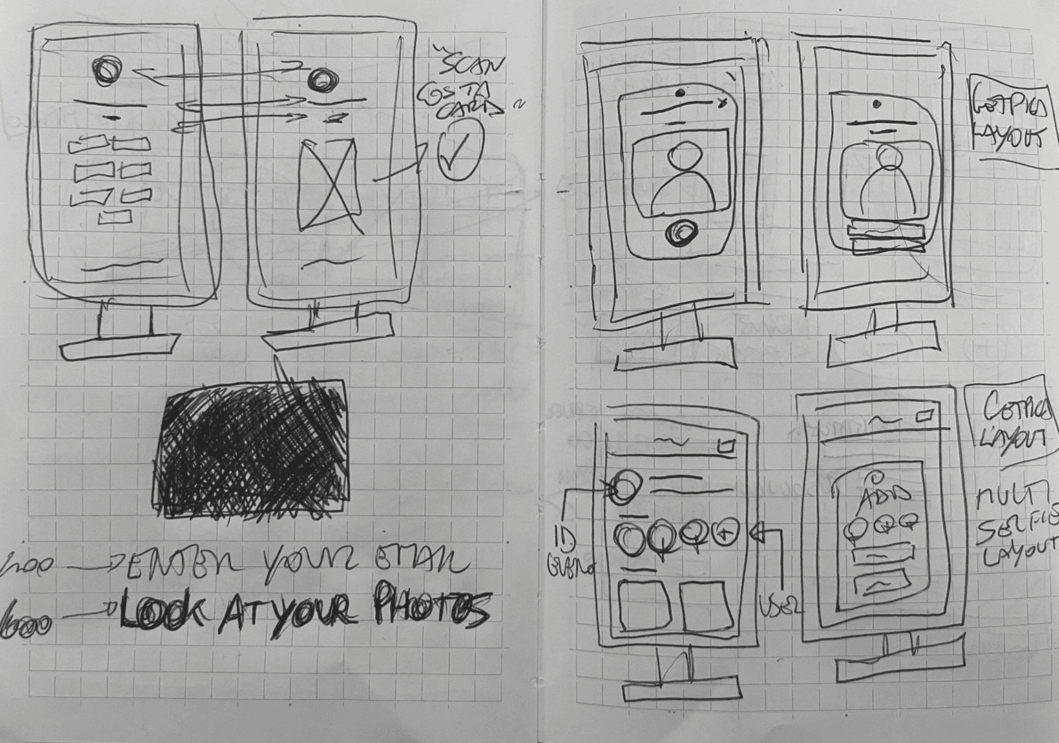
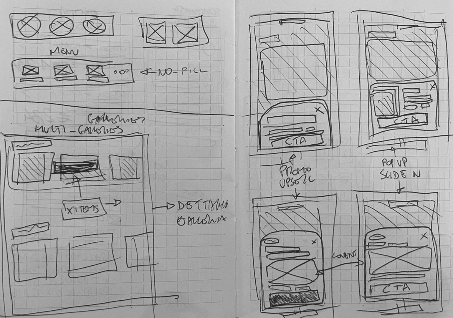
starting hand-Sketches AS A "QUICK" WAY TO UNPACK IDEAS AND DECONSTRUCT THE ELEMENTS
Starting with pen and paper was an obvious choice. Before touching Figma, sketching the main flows helped understand how elements could be distributed across a tablet screen, and revealed spatial problems that are easy to miss on a digital canvas. Old school, but still one of the most effective ways to think.
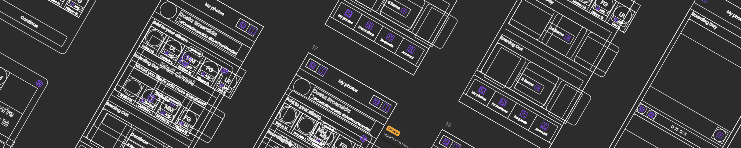
Low-fi wireframes - FIGMA OUTLINE MODE ALSO HELPS ME PUT THINGS IN PERSPECTIVE.
03 - Visual Evolution — From Early Concepts to Final Costa UI
From sketching, the work moved into Figma. Without official brand guidelines yet, the starting point was Costa Crociere's website, using it as a visual reference to build screens that already felt close to their identity, even before the real system arrived.
The first semi-official screens started taking shape. We explored different scenarios within the app system, testing color relationships, typographic hierarchy, contrast ratios, and button density across a wide age range of users.
FIRST VERSION HI-fi wireframes
Moving quickly through versions helped align the layout and ergonomics with how the interface would actually be used: standing, on a tablet, onboard a ship.
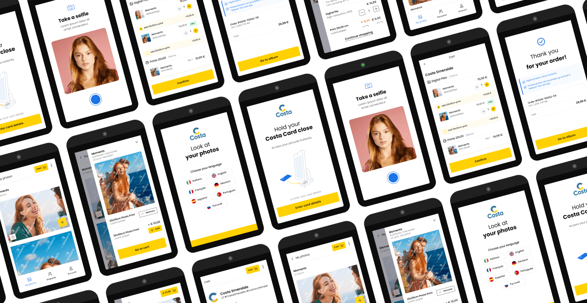
04 - BRANDED UI — POLISHED UX
At a certain point, the official brand guidelines arrived. Colors, typography, iconography, spacing, everything defined and certified by the client. What had been approximated until then could finally be built properly.
Every screen was revisited with the real system in hand: the login flow, the gallery, the cart, the promotions. Some were refined, others rebuilt from scratch. The result is what you see below.
Poppins
AaBbCcDdEeFfGgHhIiJjKkLlMmNnOoPpQqRrSsTtUuWwXxYyZz
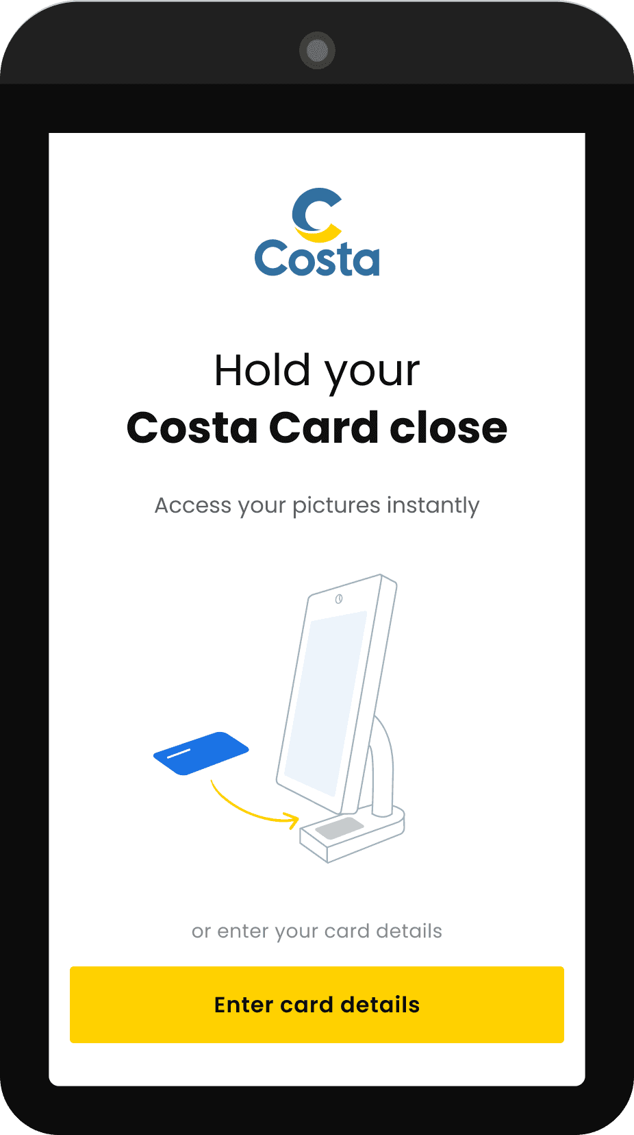
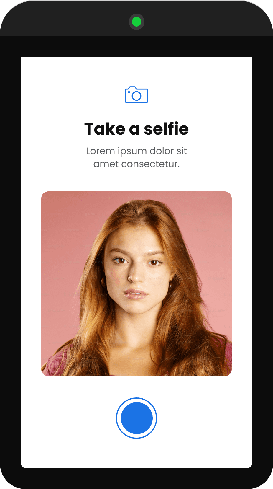
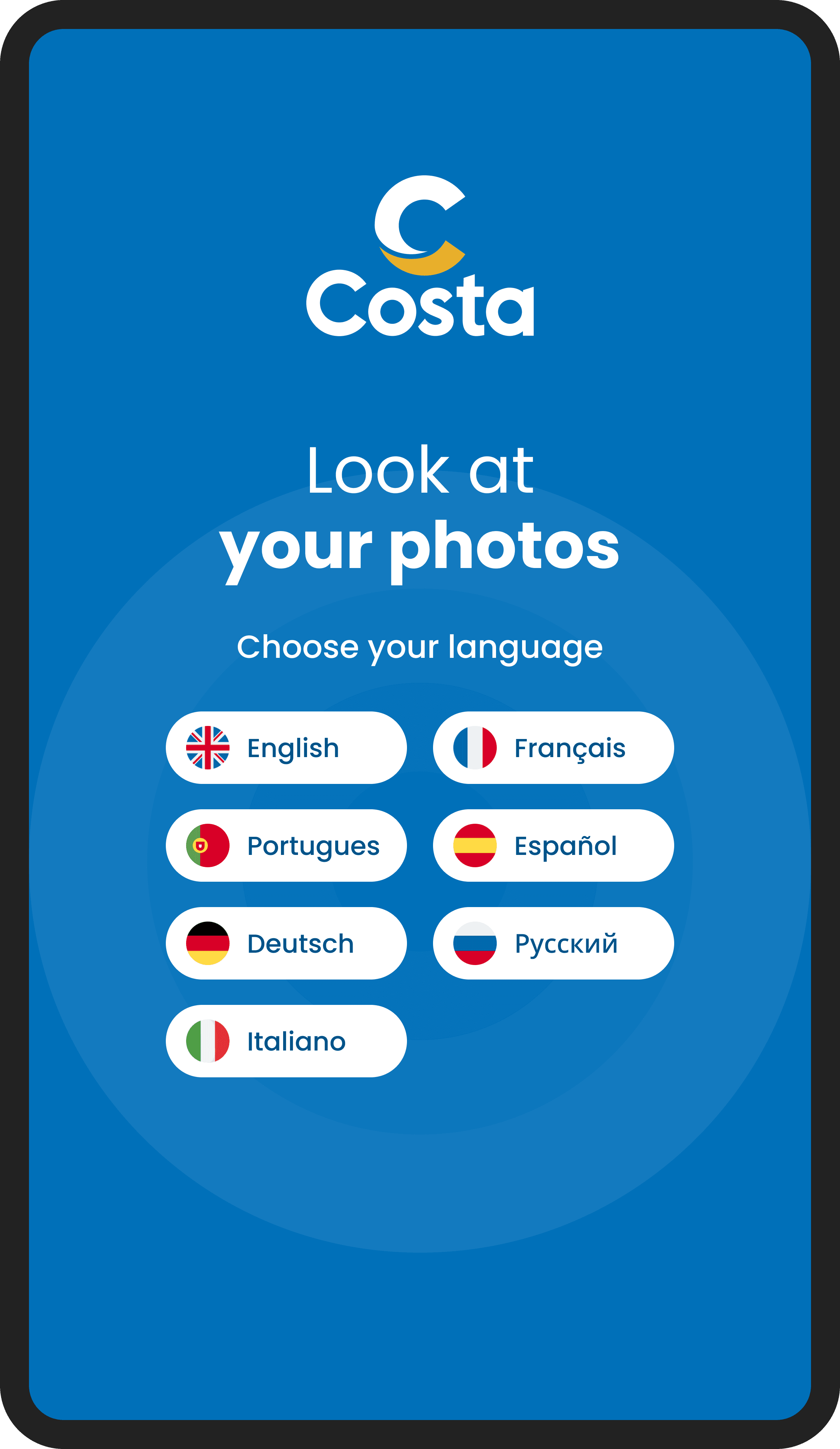
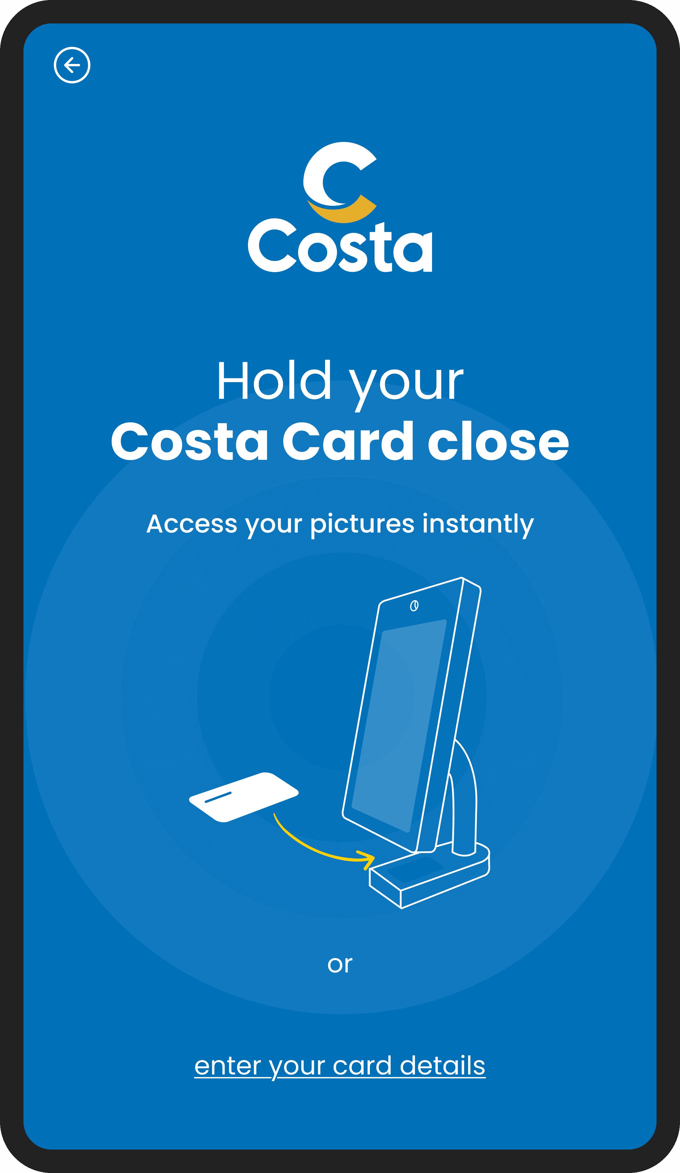
ONBOARDING flow with card scan and face selfie for recognition
The Costa Card login was already part of the system. Every guest onboard uses it for payments, room access, and ship services. Our job was to make it feel native to the new interface: hold the card close to the tablet, and you're in instantly. For those without the card at hand, manual entry remains available as a fallback. Two paths, same result, zero friction.
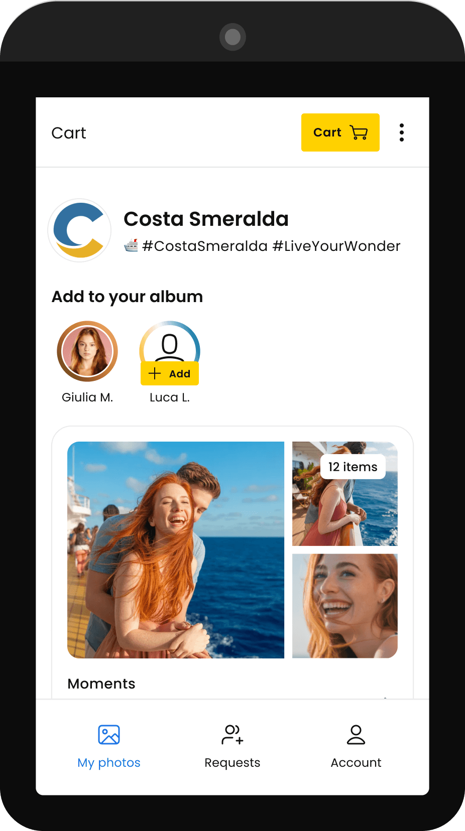
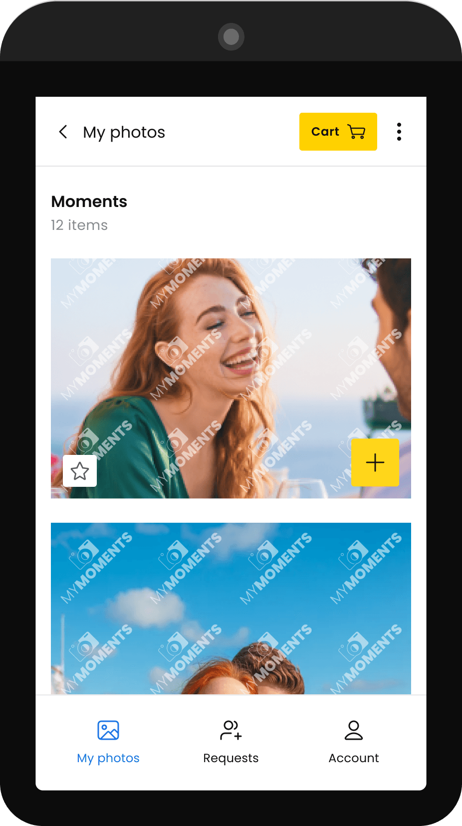
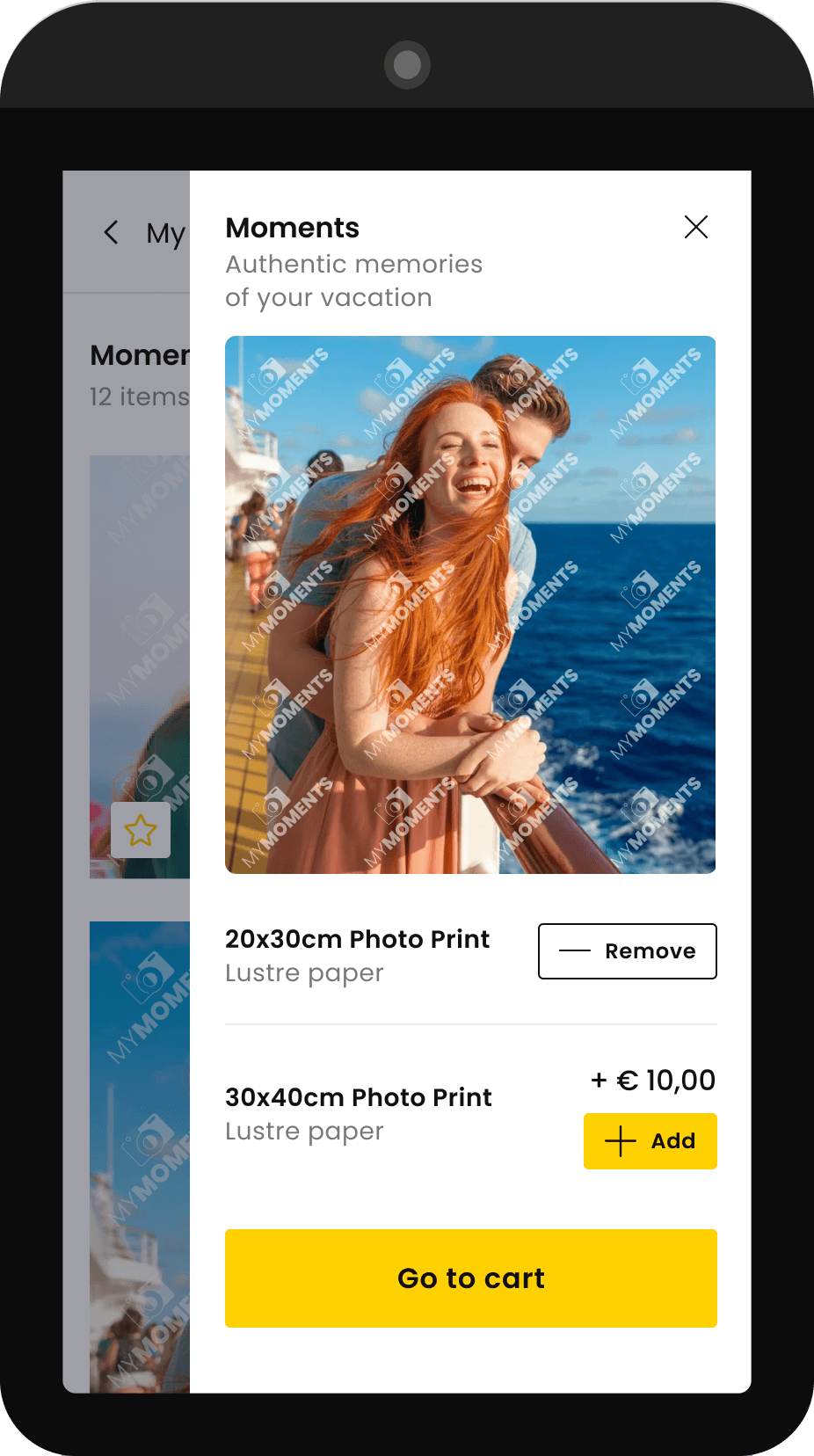
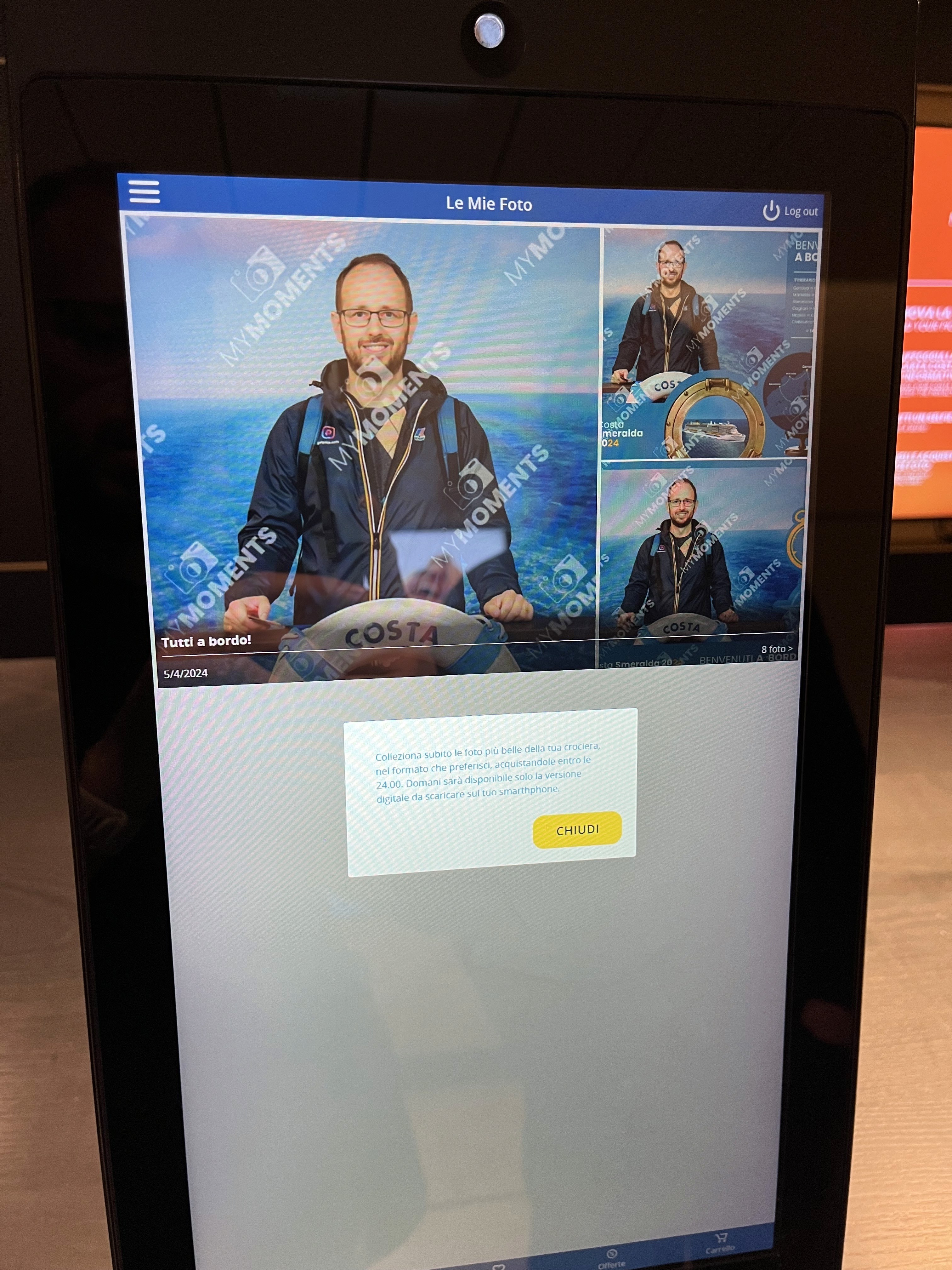
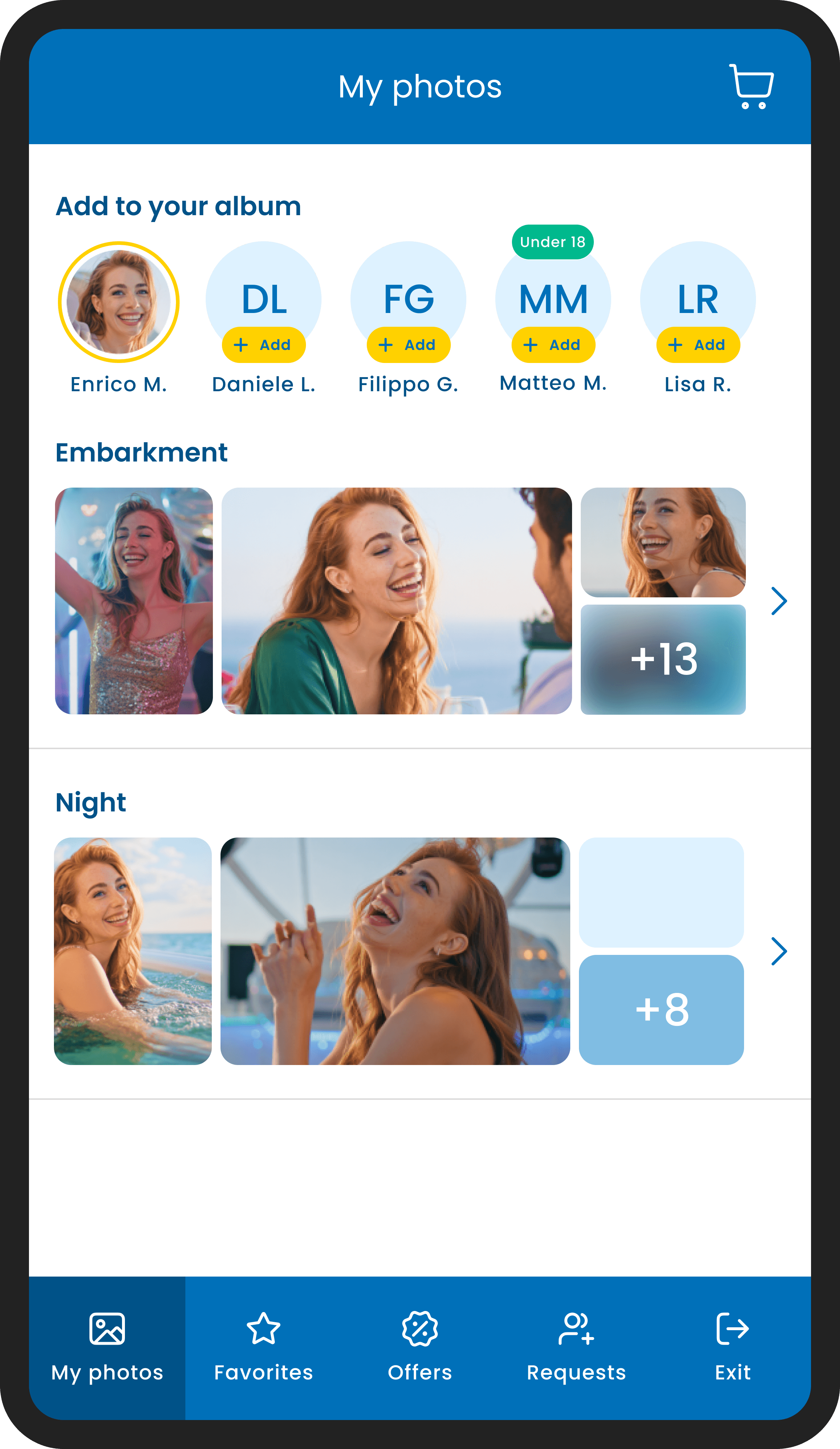
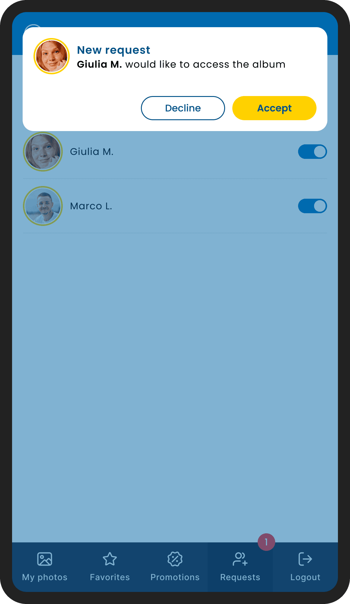
event album with multigalleries, photo list and photo details with purchase options
Once logged in, guests land directly on their personal album, every photo already filtered and ready. From there, each image can be previewed in detail, added to the cart individually, and purchased in different formats: digital file or physical print. No searching, no scrolling through strangers. Just the moments that belong to you.
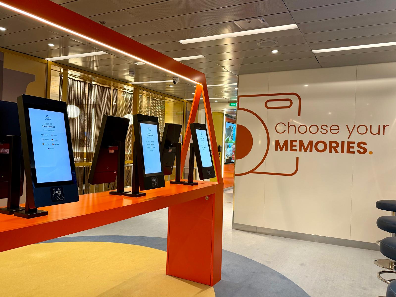
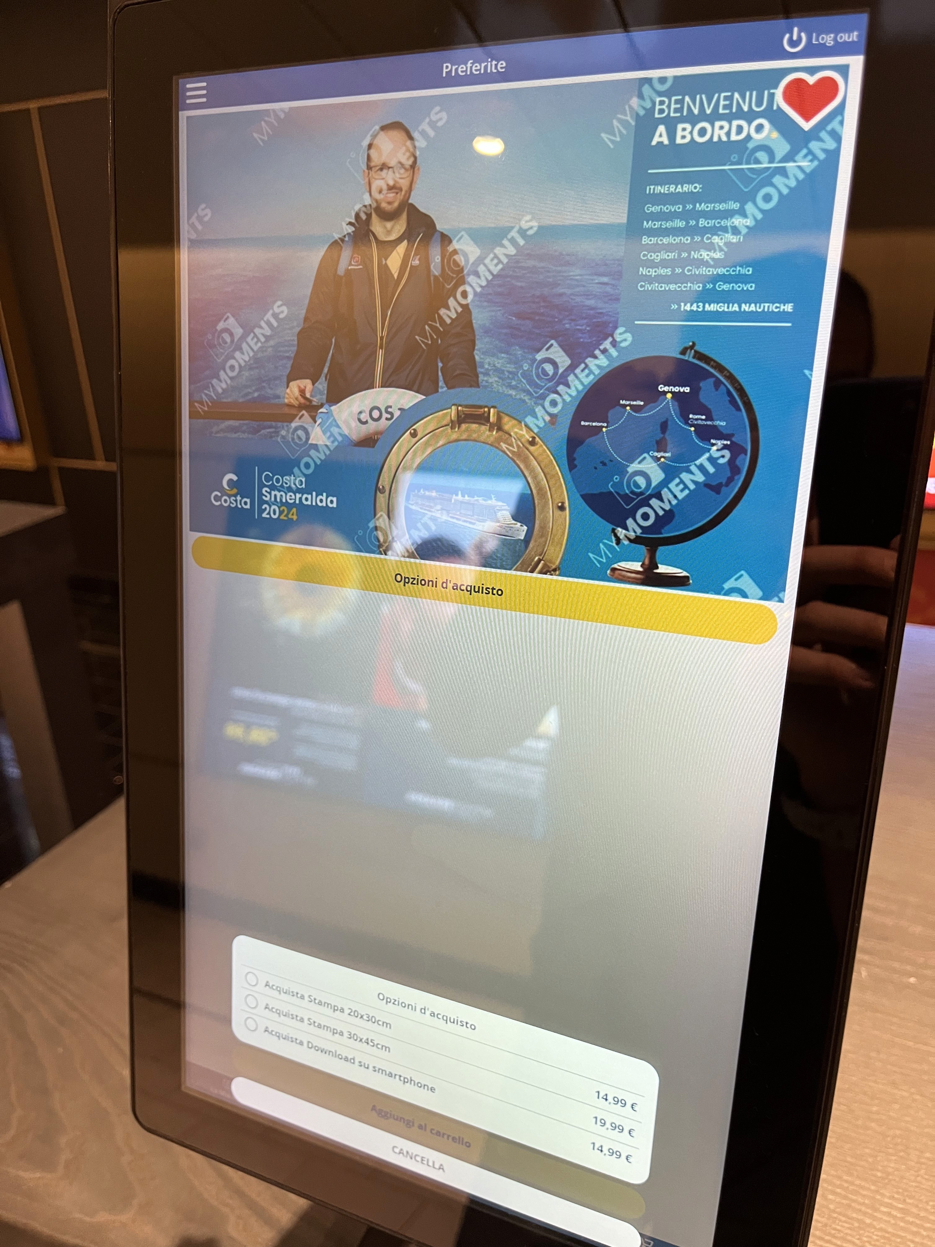
THE PHOTO SHOP, ONBOARD
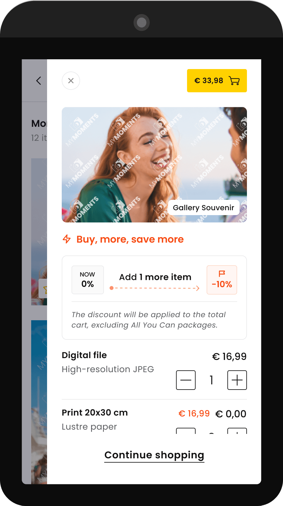
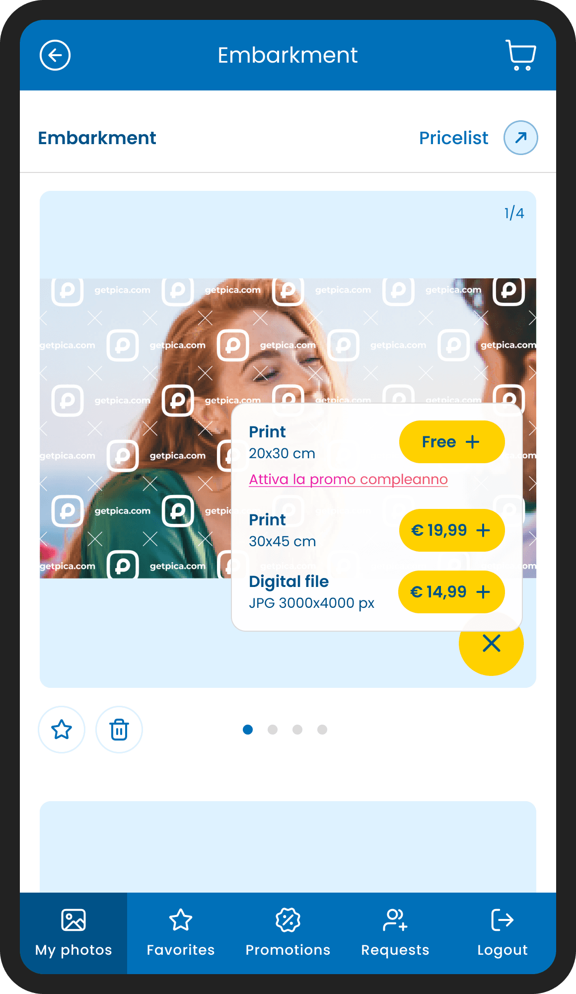
Promotions were defined by the client, not by us. The design challenge was translating their logic into something clear and motivating for the user, without making it feel like a push.
This screen is one example: a discount unlocked by adding one more item to the cart. The mechanic needed to feel like an opportunity, not a condition. The solution was a small progress indicator, an arrow moving from zero toward the discount, turning the offer into a mini goal to reach.
Supported by a direct copy line, the whole thing reads as an invitation rather than a sales pitch.
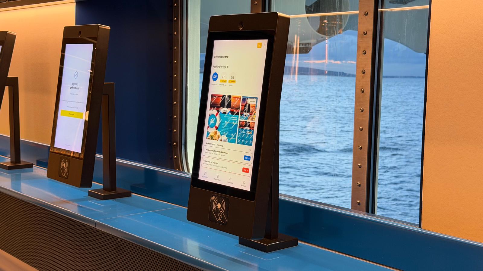
THE PHOTO SHOP, ONBOARD
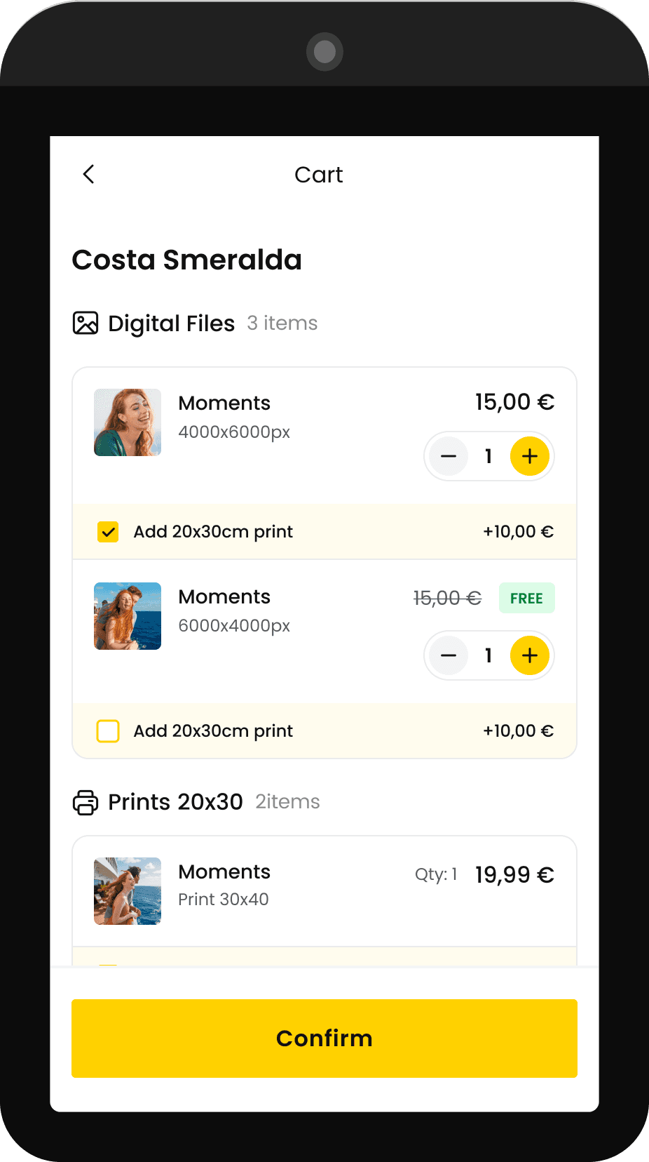
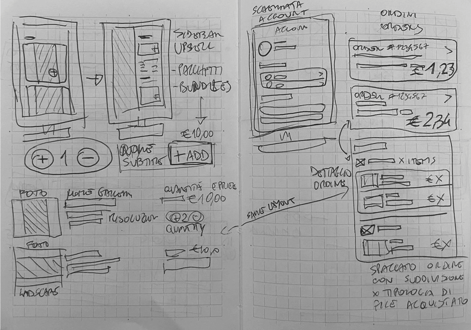
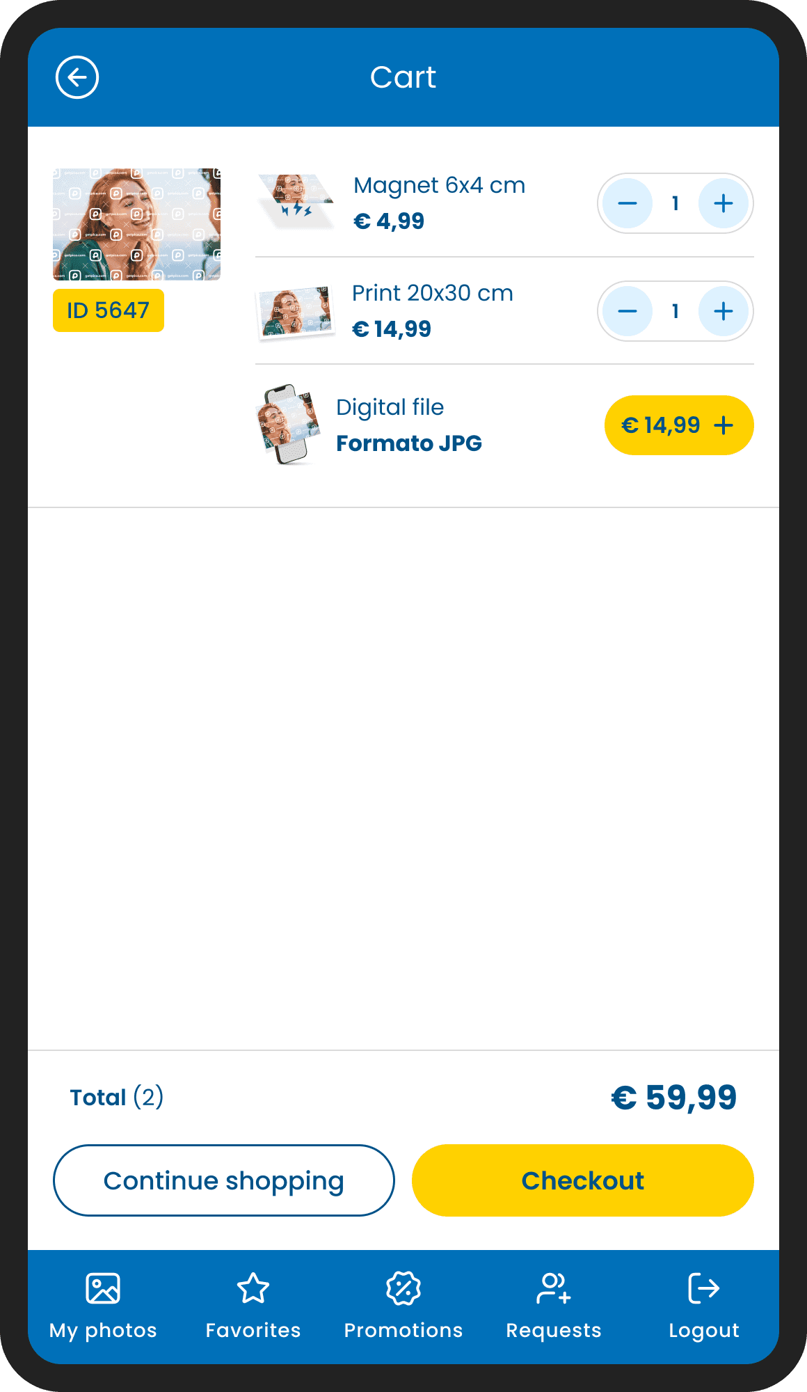
CART & ORDER CONFIRMATION
The cart follows the same logic as the main app, but adapted for the tablet context. Each item is displayed individually and expanded, because every single photo is an opportunity to add a print, adjust the quantity, or include an extra format. Grouping them would have hidden that flexibility. Items are organized by category, digital files and prints, keeping the order summary clear even when the cart grows.
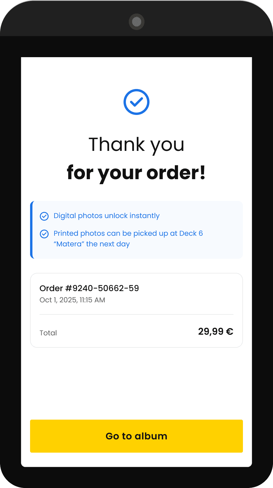
Once confirmed, the experience closes cleanly: a minimal thank you screen, the order details, and a single CTA to go back to the album. The flow is deliberately circular, once the purchase is done, you're back where you started. Ready to keep browsing, ready to buy again.
Conclusion
——
Working with a client like that was a great honor, and to be a part of this project was fun and challenging, I must say.
Being the only designer in a small team meant every decision had to be quick and ready to ship, there was no time for long review cycles. I realized that daily collaboration with developers is extremely important, it taught me how much technical constraints can influence design choices. Learning to work within those limits was challenging too.
Working with the client's official brand guidelines was a game changer because we could finally head into the right direction in terms of user interface. It meant taking an external visual system and fitting it into something already in progress, a challenge that pushed the UI toward much greater consistency.
At its core, this was a redesign built on top of an existing system, with real technical constraints, a real client, and real users onboard.
Thank you for reading
Filippo Gori
© 2026
Filippo Gori